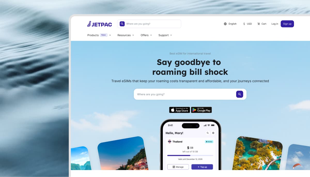
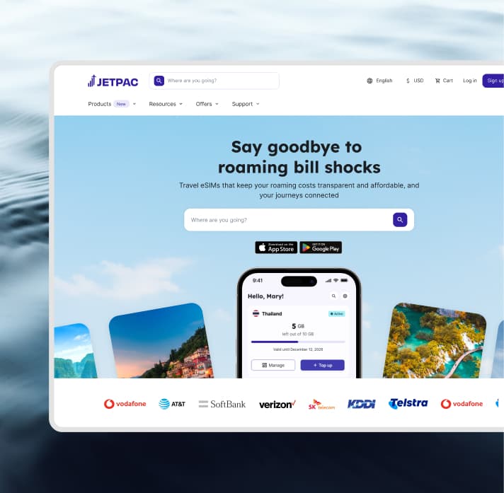
One destination for every product
Consolidated four disconnected purchase paths

Design QA
4 Engineers
1 PM
E-commerce
Product Strategy
3 months post-launch


Jetpac has grown into a multi-product company
Jetpac started as a data eSIM app. As the company expanded into Voice, Lounge, and Fast Track, these were layered onto the existing structure rather than built into it. The app still reflected a single-product company.
The navigation restructure gave every product an entry point, covered in a separate case study. This one covers what customers find when they get there.
My role
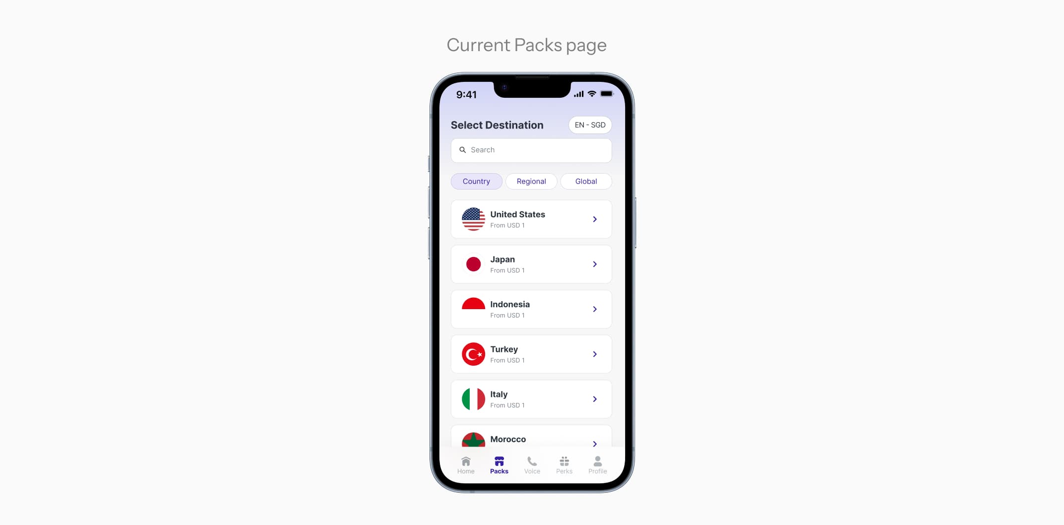
Packs only sold eSIMs
The most-visited section in the app, Packs, only sells eSIMs. Whereas a third of users were navigating elsewhere for Voice, Lounge, and Fast Track across disconnected tabs and were treated as add-ons. I identified that the structure was limiting the discovery of non-Data products.
One destination for every Jetpac product
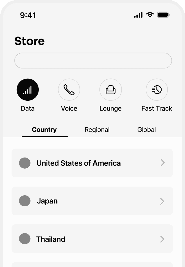
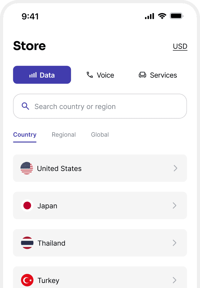
Structuring the Store
I went through three structural iterations. Aligned with the redesigned information architecture, the third and chosen structure grouped Lounge and Fast Track into one Services tab, solving both problems.
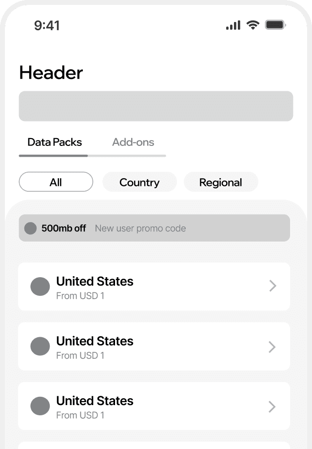
Surfacing popular packs
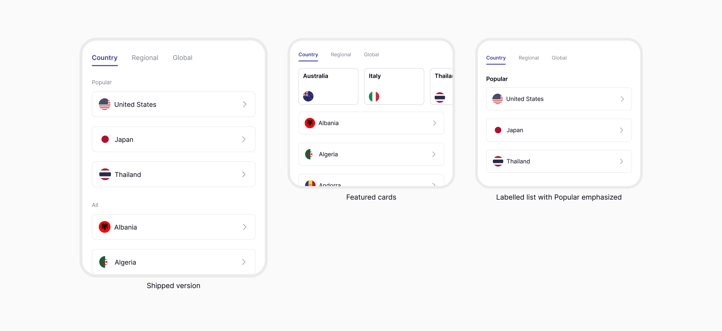
Popular destinations drive most data sales, so I proposed to add a popular section before customers see all the packs in alphabetical order. After trying featured cards and heavier labels, popular packs landed as a light section that leads the list without breaking its scan.
Improving Lounge Discovery & Selection
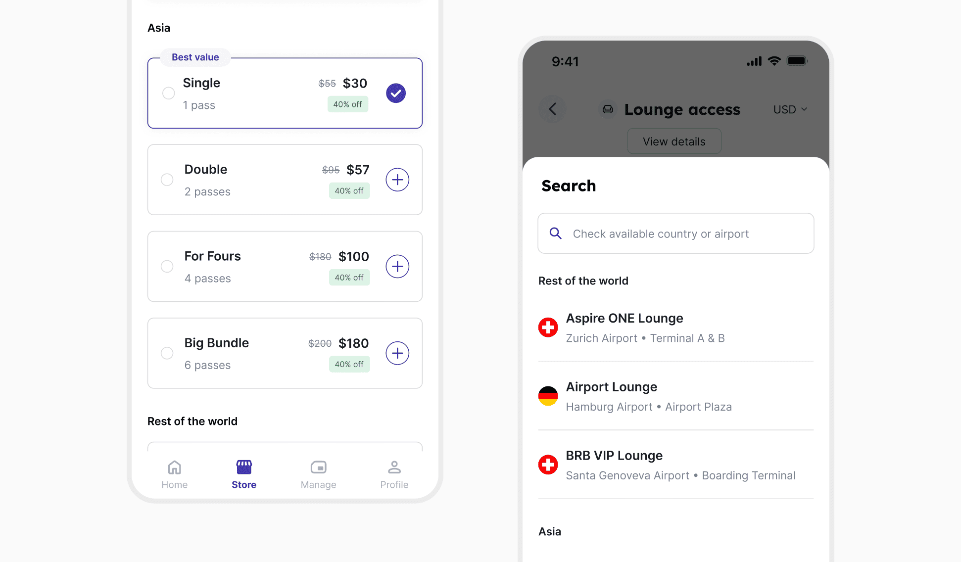
Originally, Lounge and Fast Track passes were purchased by region. My initial proposal kept this structure, but after alignment with the PM, we explored alternatives. Proposal 2 still created friction, requiring users to take multiple steps to check lounge coverage. Proposal 3 shifted to an airport-based approach and surfaced lounge availability earlier in the journey.
Chosen direction: Proposal 3 was selected as it reduced friction and made lounge coverage easier to understand before purchase.
Introducing Data, Voice, and Services
Each product gets a dedicated tab, so Voice and Services are no longer buried as data pack add-ons
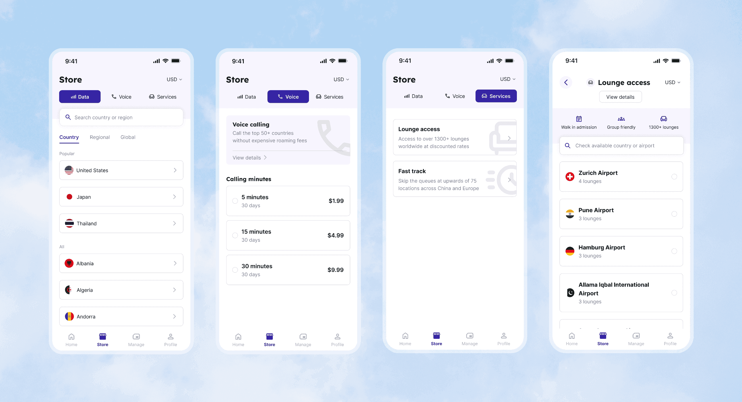

Search scoped to Data destinations. Results filter in real time as you type, covering Country, Regional, and Global packs in one view.
Voice's small catalogue meant that the purchase flow could stay on one screen. Tap a pack, adjust quantity up to 10, and add to cart without leaving.
Lounge access searched and purchased by airport. Select an airport to see available lounges, with lounge count shown upfront so travellers know what's available before they tap.
What I learned
- 1Working with vague briefsProduct handed over a feature list, not a spec, with no direction on hierarchy. I read that as license to propose structure rather than wait for one. Tabs-per-product was flagged unscalable by the APM and CTO. Grouping Lounge and Fast Track into one Services tab is what was more scalable for all four products.
- 2Designing around backend constraintsThe Lounge and Fast Track logic went through repeated back-and-forth between product, me, and backend, because how passes could be shown was tied to how they were structured in the backend. The brief wasn't fixed enough to design against once, so the IA changed as the data model came into focus. Design decisions here weren't just about user clarity, they were a negotiation with what the backend could actually support.
- 3Speed without losing quality7 drafts went through different visual treatments and structures before the final direction landed. Moving quickly was only effective because I built in distance between rounds. Coming back with fresh eyes caught issues that reviewing the same screen for the tenth time would have missed.