Back

Website homepage redesign
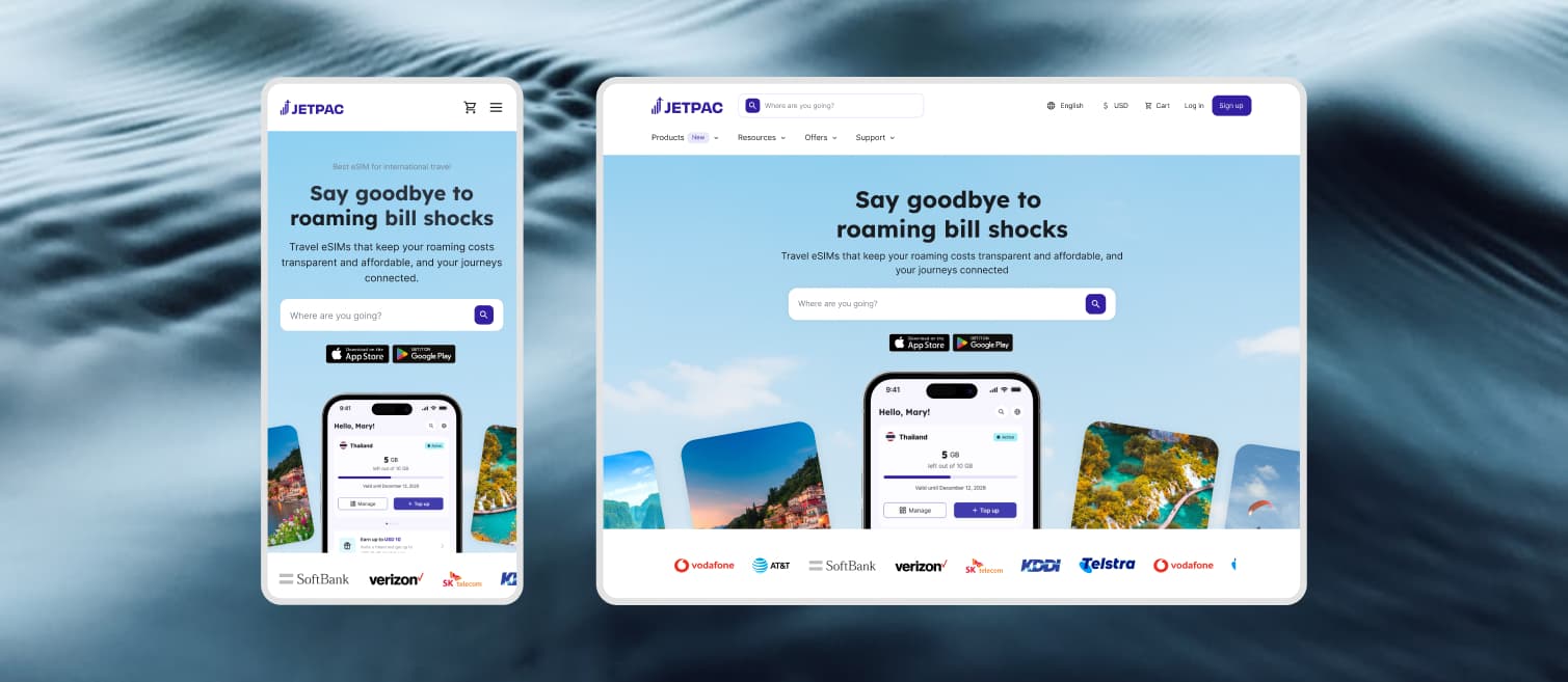
Transforming a single-product page into a multi-product conversion engine for 39k monthly travelers|Visit site
RoleSenior Product Designer & Design Lead
Collaborators2 Product Designers
2 Front-End Engineers
DurationApril – June 2026
ScopeInformation Architecture
Responsive Design System
Design QA & Engineering Alignment
Contributions

My role

Design Leadership & Final ExecutionStepped into hands-on execution after earlier team concepts stalled on layout density and core hierarchy, unblocking stakeholder bottlenecks to ship the final component system.
Design QAPartnered directly with engineering to review builds, eliminate visual regressions, and enforce pixel-perfect interaction specs.
Stakeholder alignmentPitched and secured sign-off from marketing, business, product, and tech, aligning cross-functional teams onto a launch direction.
Impact

Evolving the homepage into a high-converting multi-product discovery hub

+7%
Hero-to-product click-through rate
5–6m
Average desktop session duration exploring products
8
Core modular sections designed and tokenized
Problem

39k monthly visitors were landing on a single-product page, leaving secondary offerings invisible

While Jetpac expanded its ecosystem to include Voice, Lounge Access, and Fast Track, the homepage remained stuck on an eSIM-only view. The existing surface suffered from two core bottlenecks:

Original homepage
  • 1
    Zero Discovery for Secondary OfferingsDespite being Jetpac's highest-traffic web entry point, non-eSIM products had 0% visibility, throttling cross-sell potential at the top of the funnel.
  • 2
    Visual & Structural DecayThe UI language lagged behind Jetpac's evolving brand identity, creating an outdated first impression that actively undersold the platform's full value.
Solution

Transforming a single-product page into a multi-product conversion hub for global travelers

Redesigning Jetpac's web presence from an eSIM-only landing page into a scalable multi-product ecosystem, giving instant visibility to Voice, Lounge Access, and Fast Track while driving top-of-funnel conversion.
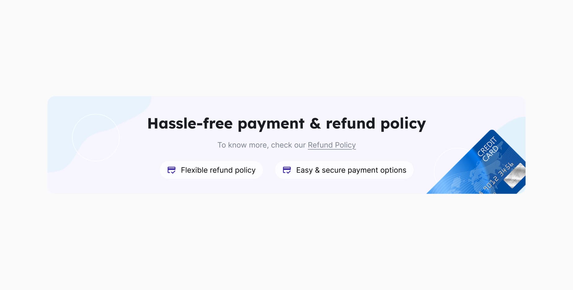
New components
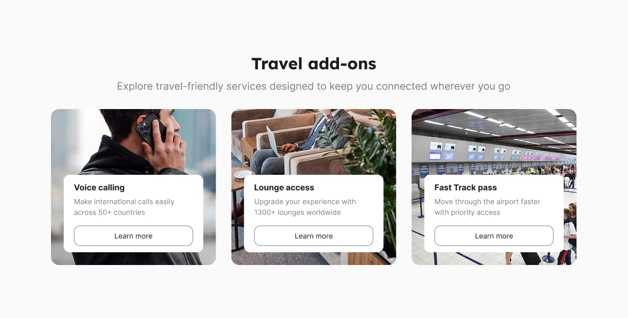
Add-onsA dedicated cross-selling module that surfaces our other products: Voice Calling, Lounge Access, and Fast Track passes into visual entry points to drive top-of-funnel discovery.
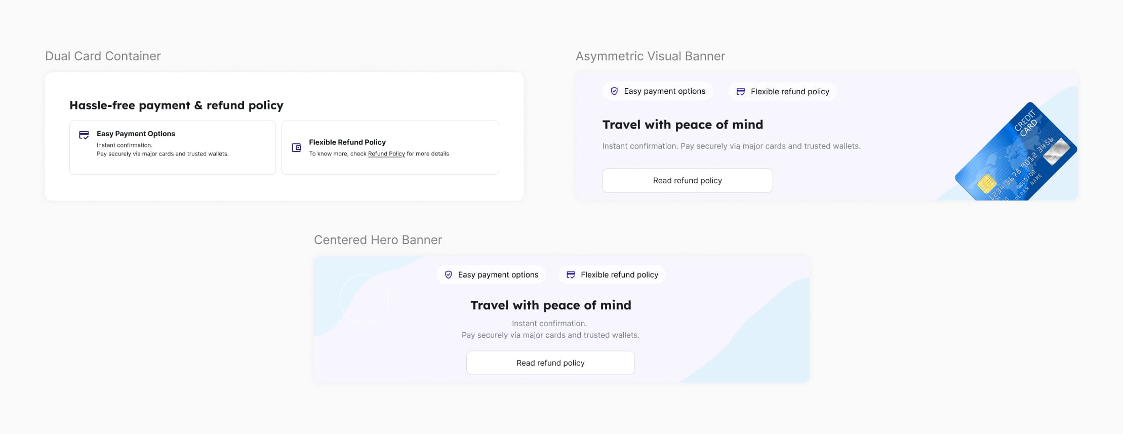
Payment policyA proactive trust signal component placed prior to checkout to address primary conversion drop-off triggers by highlighting flexible refunds and secure payment options.
Stakeholder Alignment

Navigating Legacy Explorations

I audited past homepage explorations and facilitated stakeholder alignment sessions to separate mixed requirements from core business goals, allowing me to break the monolithic page into modular component systems for structured optimization.
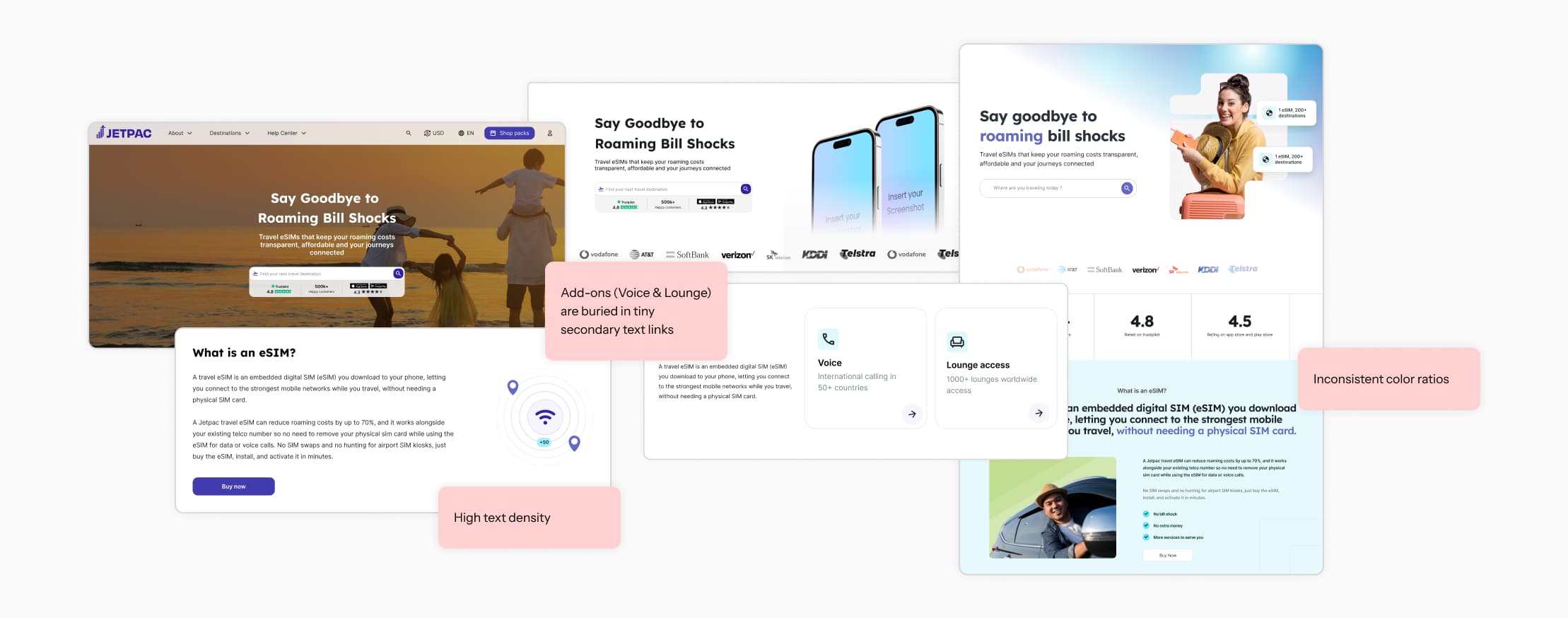
Content & Structure Audit

Information Architecture & Content Restructuring

To transform the homepage from a single-service landing page into a multi-product ecosystem, I restructured the page hierarchy based on two core strategic goals.
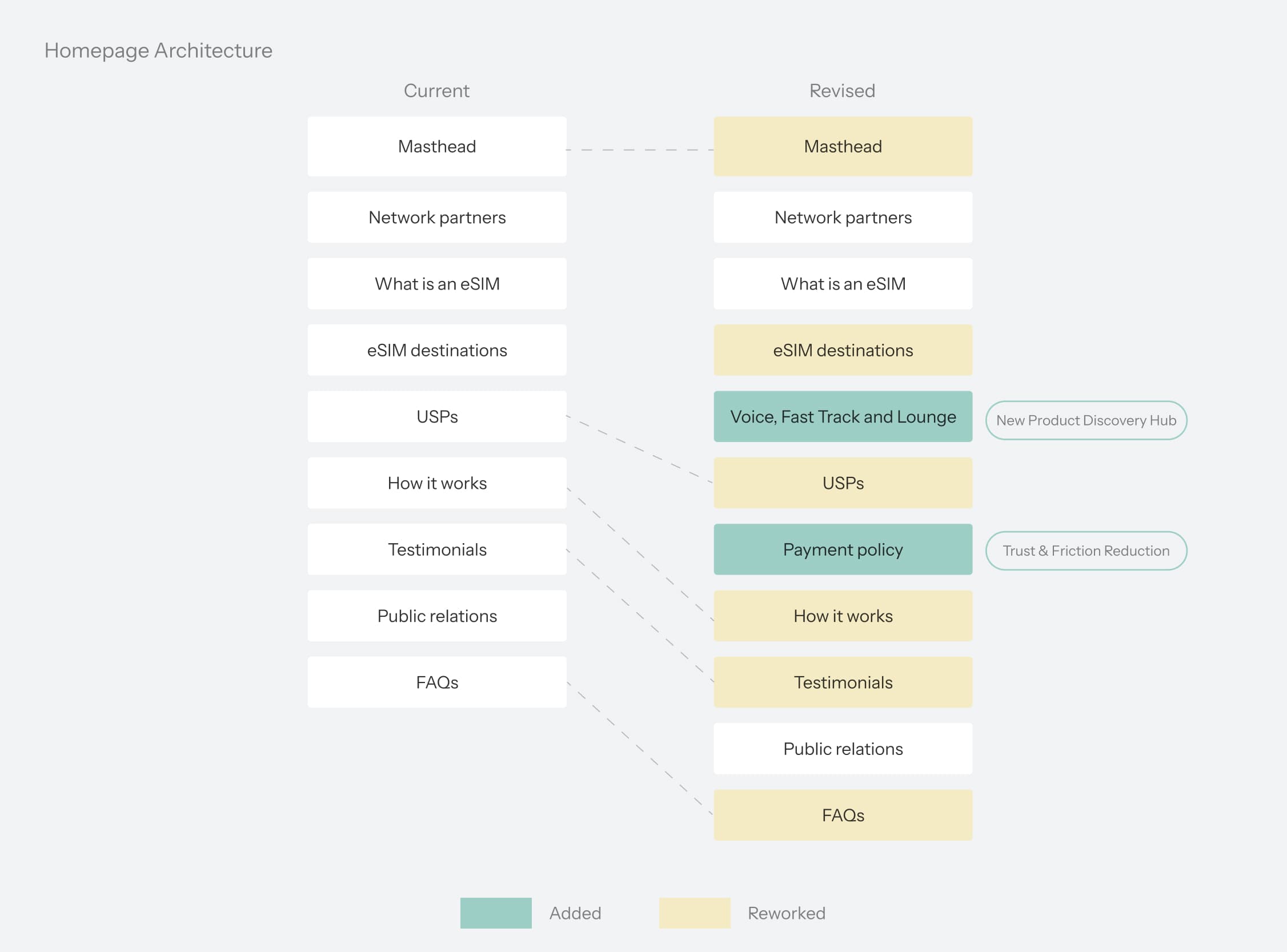
Prioritizing Multi-Product Discovery Above the FoldPlaced a multi-product hub below destination searches to surface Voice, Lounge, and Fast Track early in the journey.
De-risking Purchase Intent with Proactive Trust SignalsSurfaced our existing Moneyback Guarantee upfront, turning a buried policy into a positive conversion incentive that mitigates checkout hesitation.
Component Explorations

Exploring three visual directions for the Add-ons module

To build a scalable component framework, I evaluated distinct layout and visual patterns across key conversion modules.

Travel Add-ons
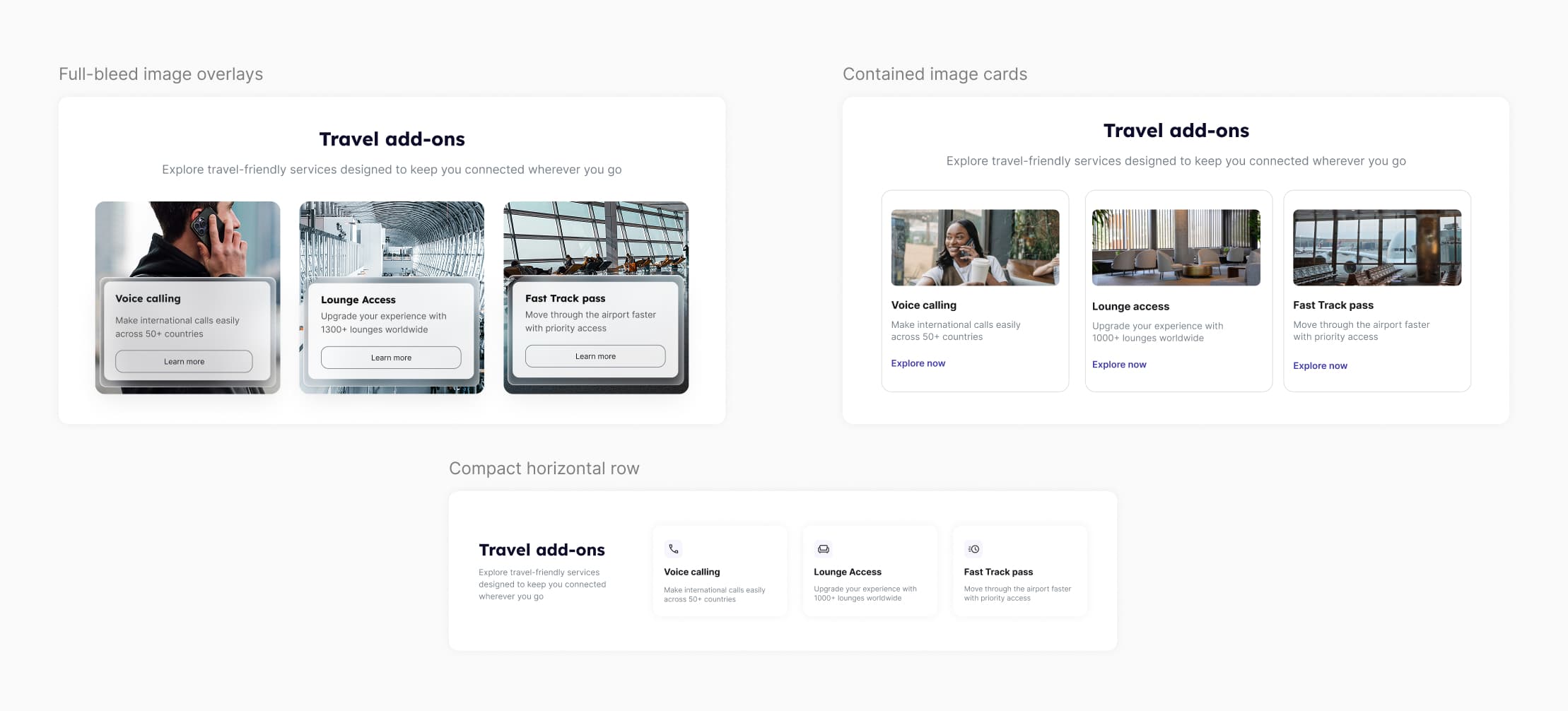
1. Contained Media CardsStandard split layout with high scannability, but felt too generic and lacked the premium travel feel we wanted for add-ons.
2. Compact Horizontal RowMinimal icon layout that saved vertical space, but removing lifestyle imagery lowered engagement and made perks easy to scroll past.
Final direction: I adapted Full-Bleed Image Overlays by removing the glassmorphism borders to fix contrast issues and eliminate an inconsistent visual pattern, keeping it aligned with our broader design system.

Payment Policy

1. Dual Card ContainerSplit policies into separate outlined boxes, but created unnecessary visual noise and felt overly administrative.
2. Asymmetric Visual BannerUsed bold credit card graphics to draw attention, but the graphic competed heavily with primary CTAs.
Final direction: Centered Hero Banner was chosen and modified by combining the balanced layout of the third option with the credit card graphic from the second, simplifying copy and visuals to build trust without distracting from conversion.

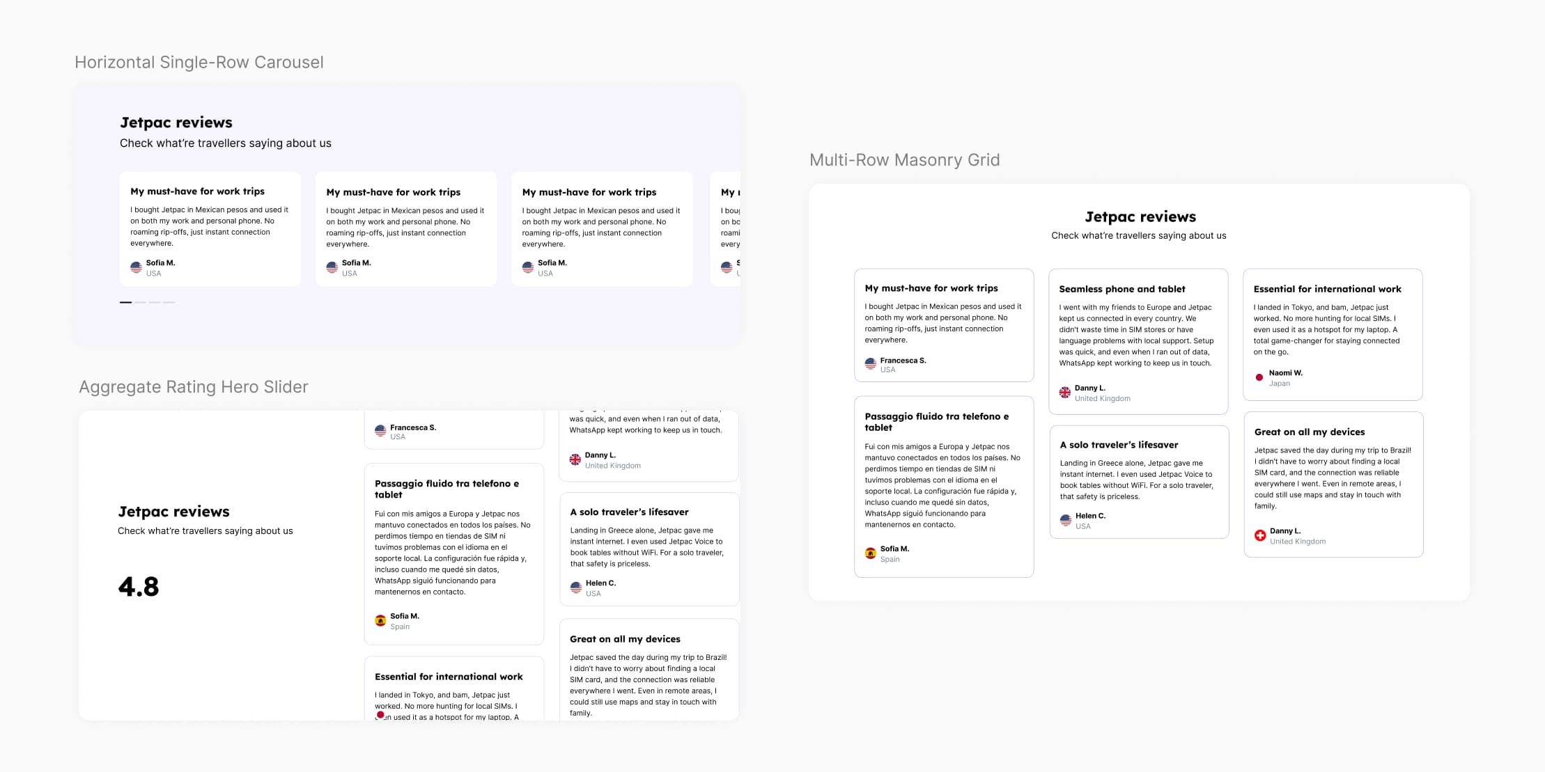
Testimonials

1. Horizontal Single-Row SliderKept vertical footprint low, but restricted review visibility by requiring manual horizontal scrolling to read additional testimonials.
2. Aggregate Rating Hero SliderProminently featured overall Trustpilot score, but squeezed individual review cards into a tight vertical layout that hindered readability.
Final direction: Multi-Row Masonry Grid was selected to maximize review density on desktop without requiring pagination, letting users scan multiple social proof points simultaneously.
Reflections

What I learned

  1. 1
    The simplest UI tasks often hold the deepest cross-functional complexity.What appeared to be a straightforward visual refresh actually demanded extensive coordination across marketing, SEO, content, and engineering teams since this was the highest-traffic page.
  2. 2
    Building scalable systems pays off instantly.Moving from fragmented early design passes to a modular component system required additional upfront effort, but substantially improved iteration speed and streamlined the engineering handoff process.
View more projects