Scaling Jetpac's navigation
Restructuring Jetpac's navigation from a single-product hierarchy to a four-product structure
3 Engineers
1 Product Manager
Information Architecture
Interaction Design
Impact & Scope
Giving new product lines room to grow without hurting core revenue
Starting as an eSIM app, Jetpac expanded into Voice, Lounge Access, and Fast Track, but only 3% of customers bought products outside of eSIMs. The challenge was to restructure web and app navigation to give every product dedicated visibility without displacing the core eSIM flow driving 95% of revenue.
Quantifiable outcomes and structural improvements post-launch
Voice, Lounge Access, and Fast Track now have dedicated entry points for the first time. The 3% cross-sell baseline was the direct target; post-launch conversion data to follow.


Jetpac had outgrown its navigation
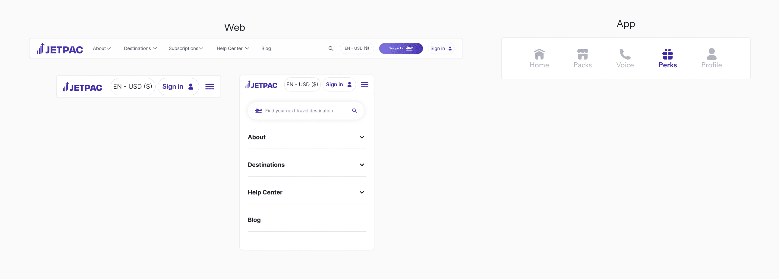
- 1The structure had a commercial costOnly 3% of customers were purchasing anything beyond eSIMs: Voice at 2%, Lounge Pass and Fast Track at 0.5% each. The products existed. The navigation made them invisible.
- 2No home for new productsVoice, Lounge Pass, and Fast Track had no unified entry point. On web, they were missing entirely. On app, Voice had its own tab while Lounge and Fast Track were in "Perks," only accessible as data pack add-ons.
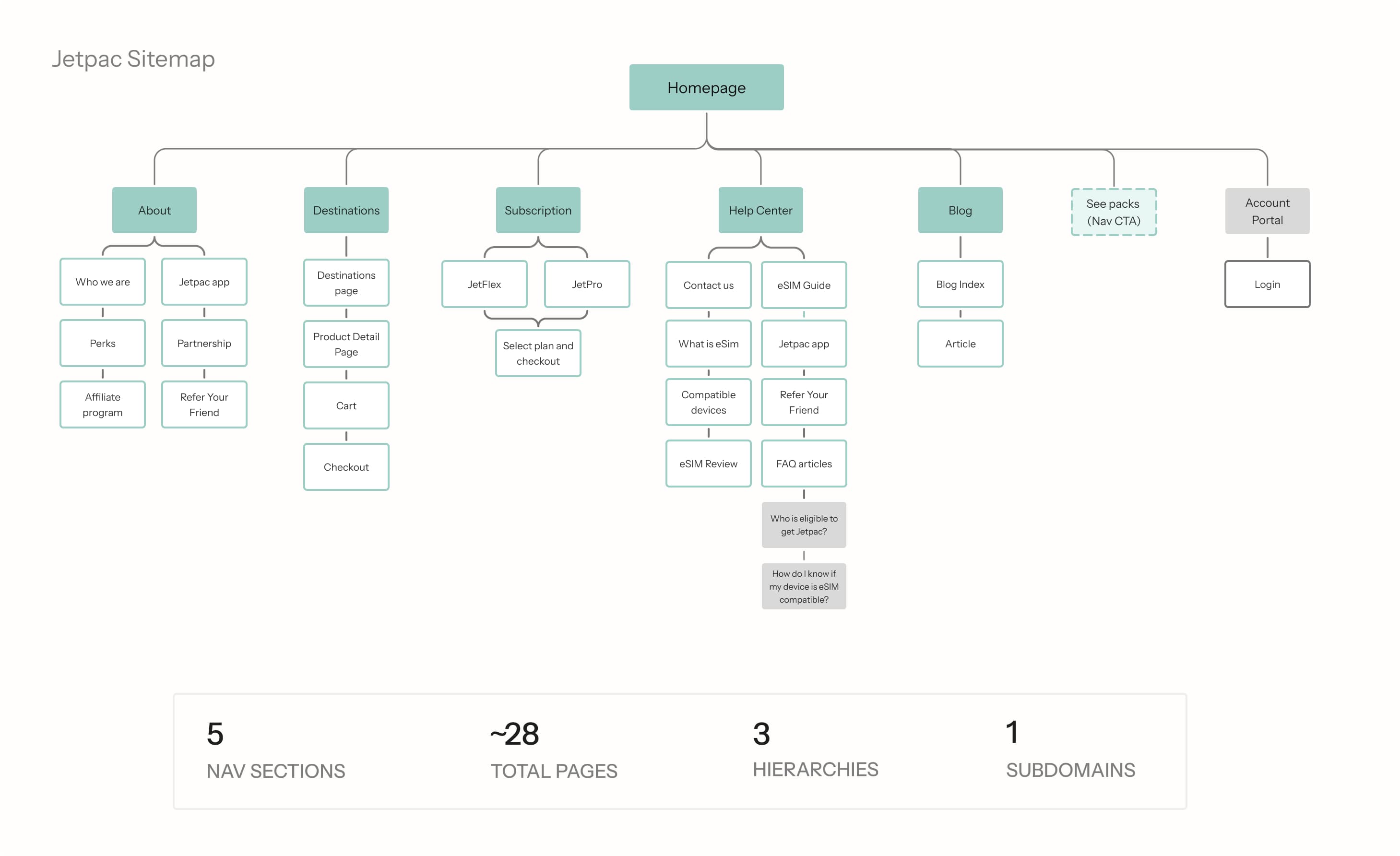
- 3Misplaced and duplicated contentCommercial links were buried under company information. The same items appeared across the nav and footer with no clear hierarchy, creating conflicting wayfinding and no obvious path to conversion.
Auditing multi-product platforms to scale Jetpac's architecture
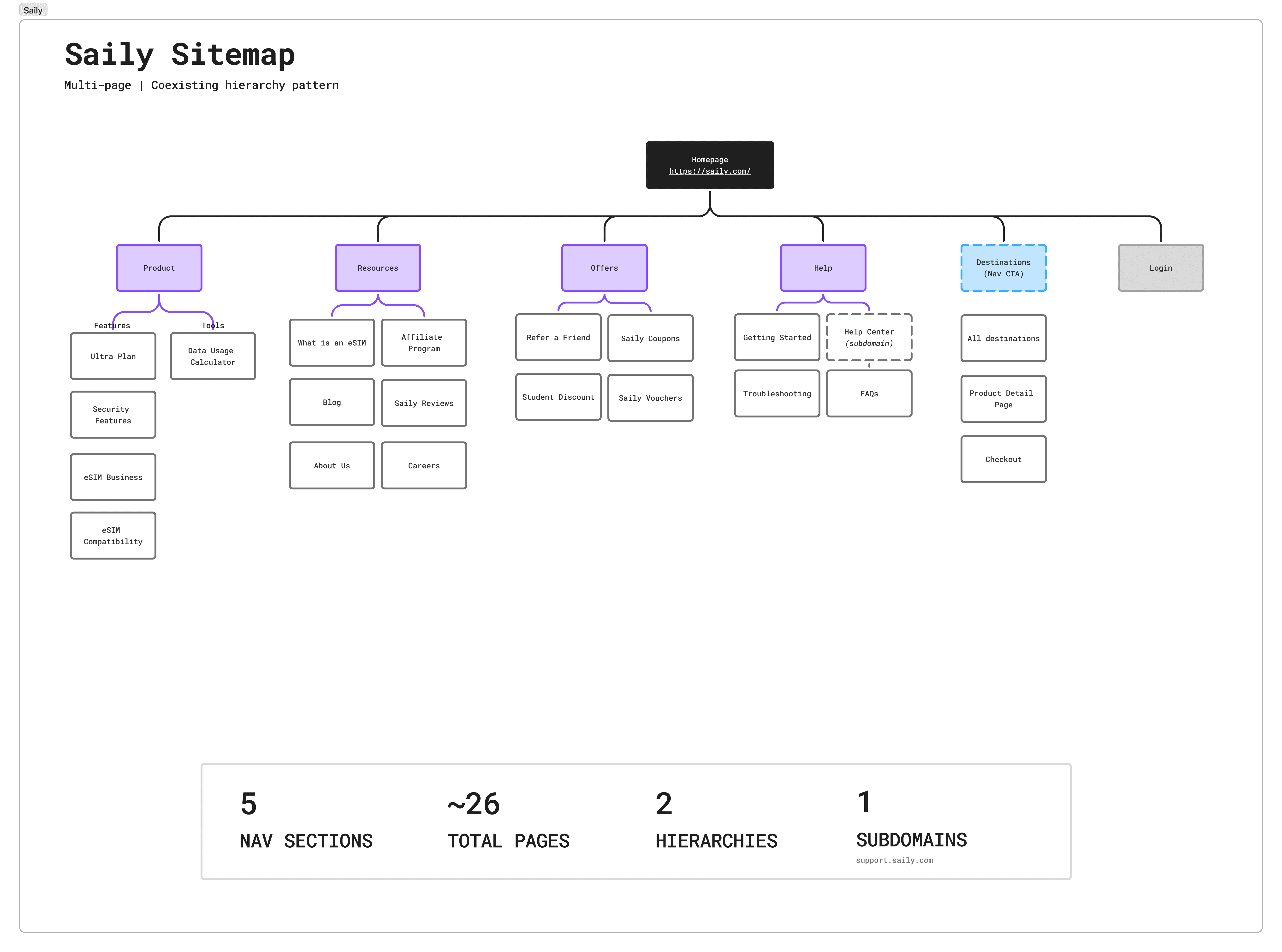
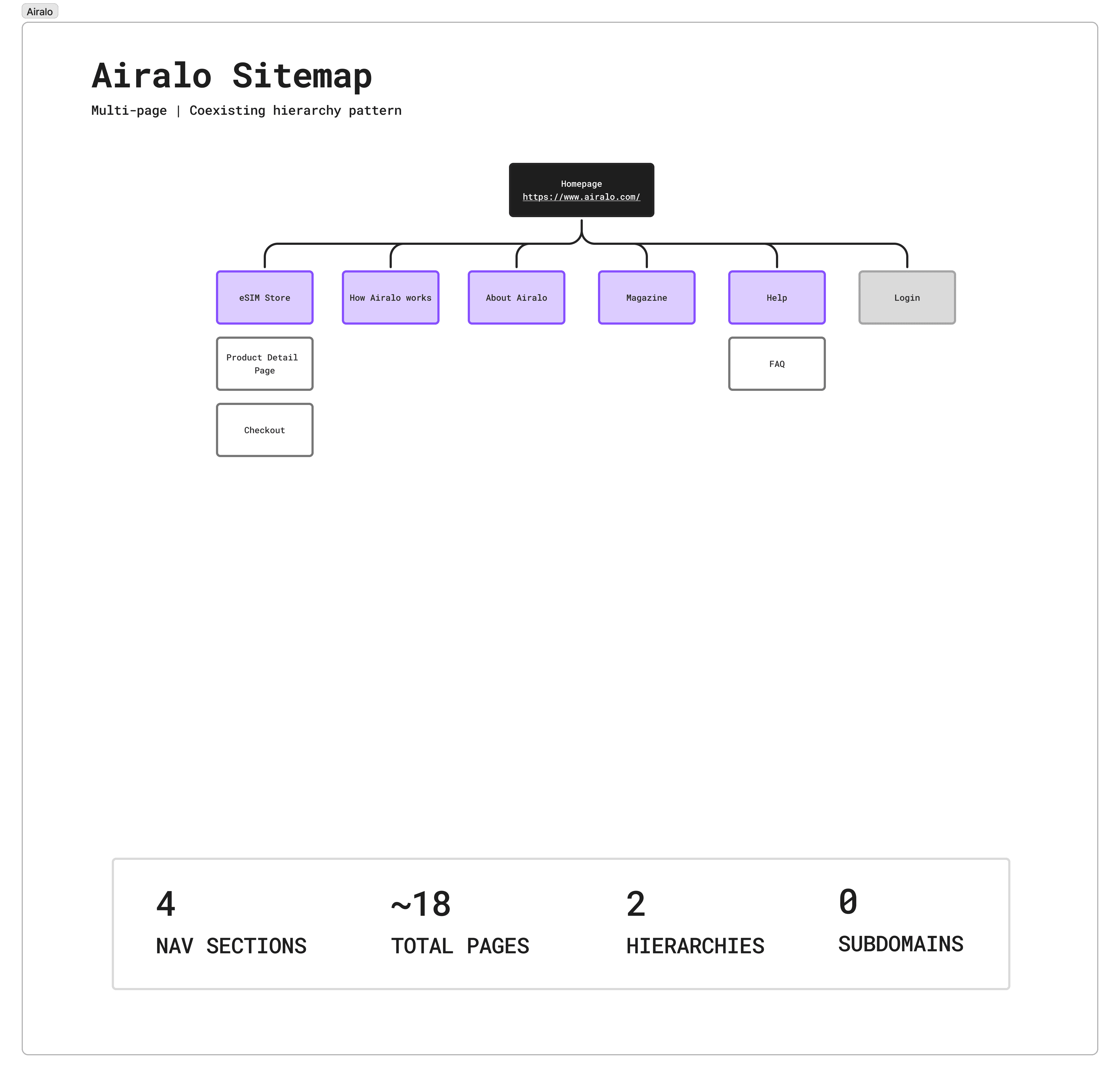
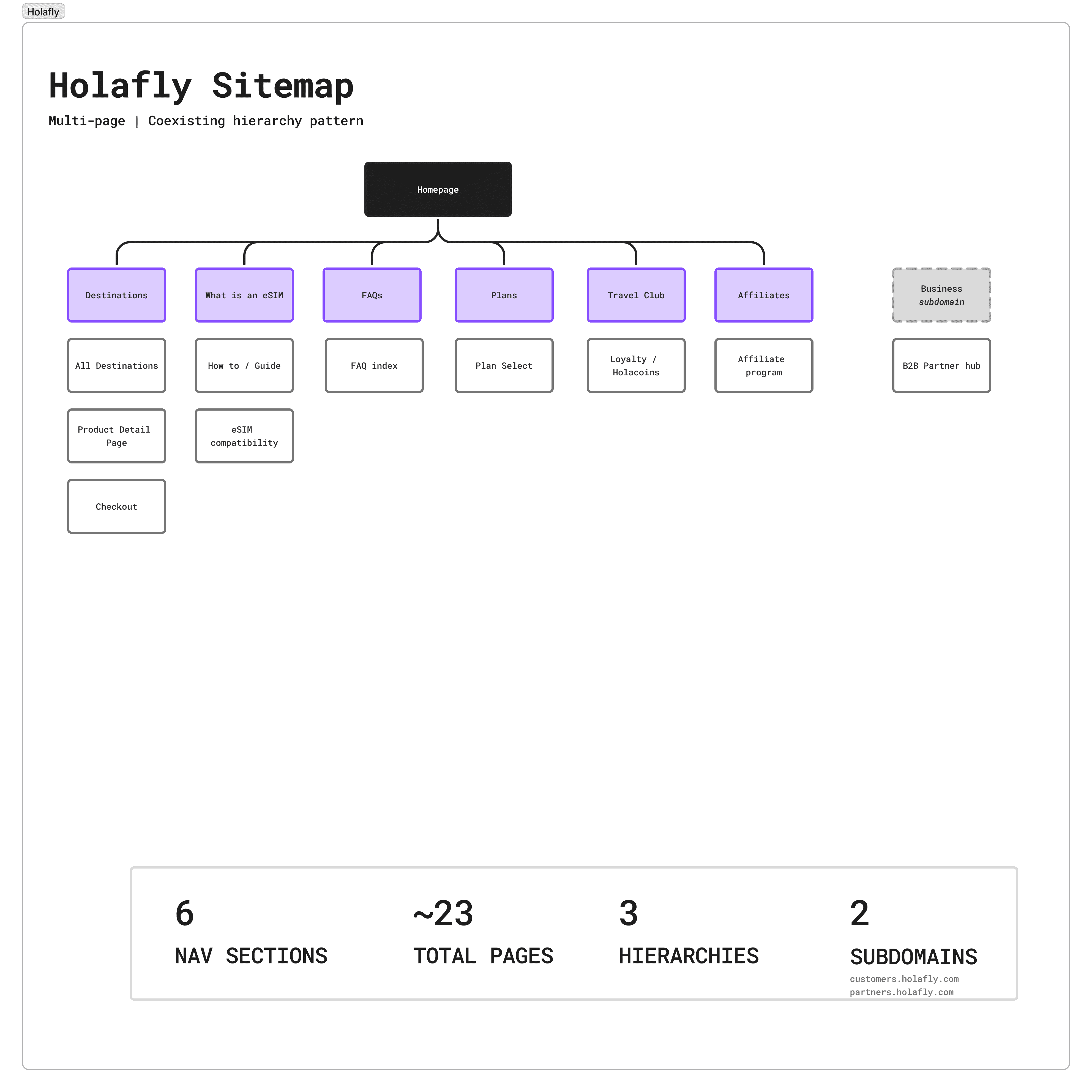
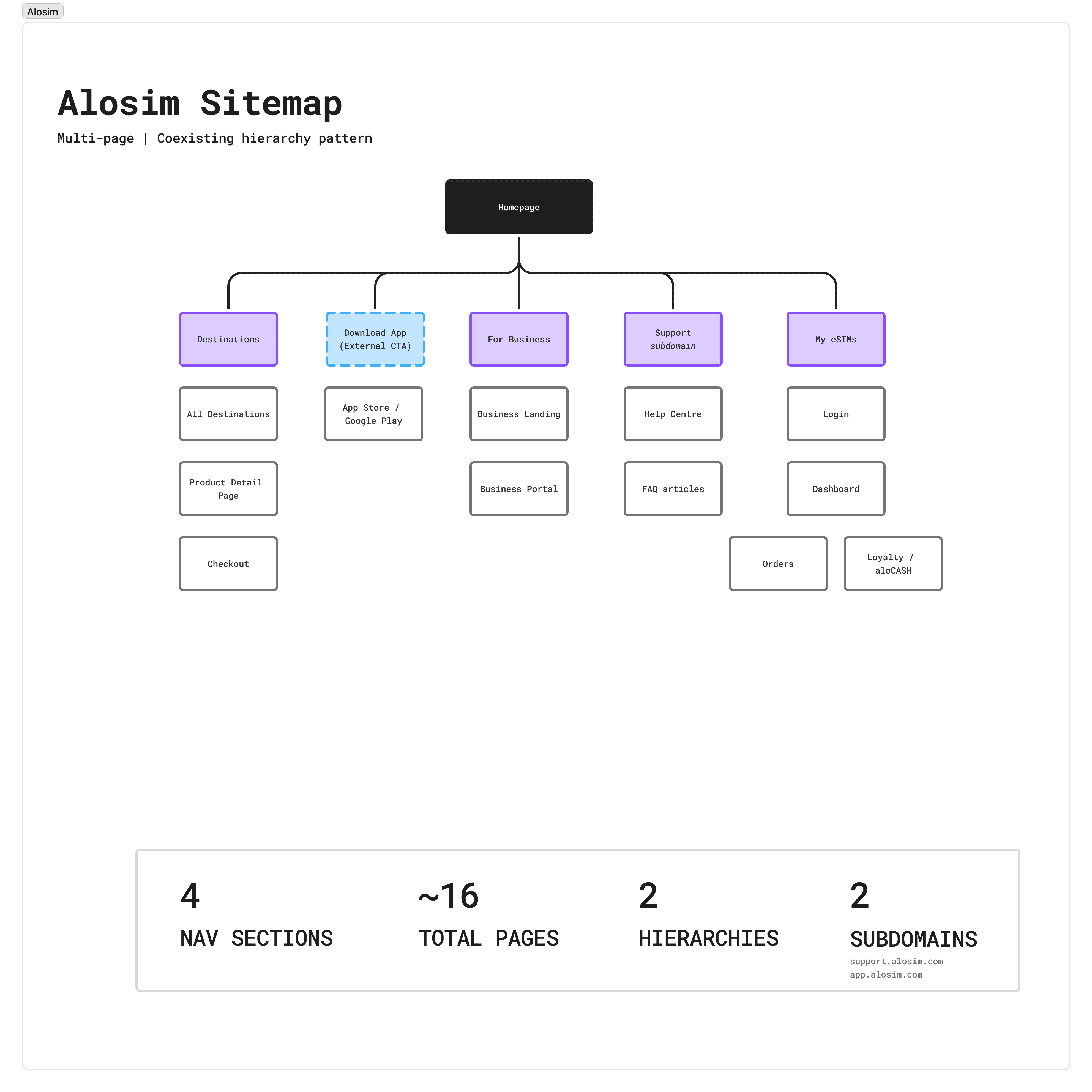
I audited Jetpac's sitemap and benchmarked it against direct eSIM competitors (Airalo, Holafly) and multi-product fintech apps (Revolut, Wise) to find scalable patterns for surfacing new product lines.
Balancing core business goals across 3 sitemap directions
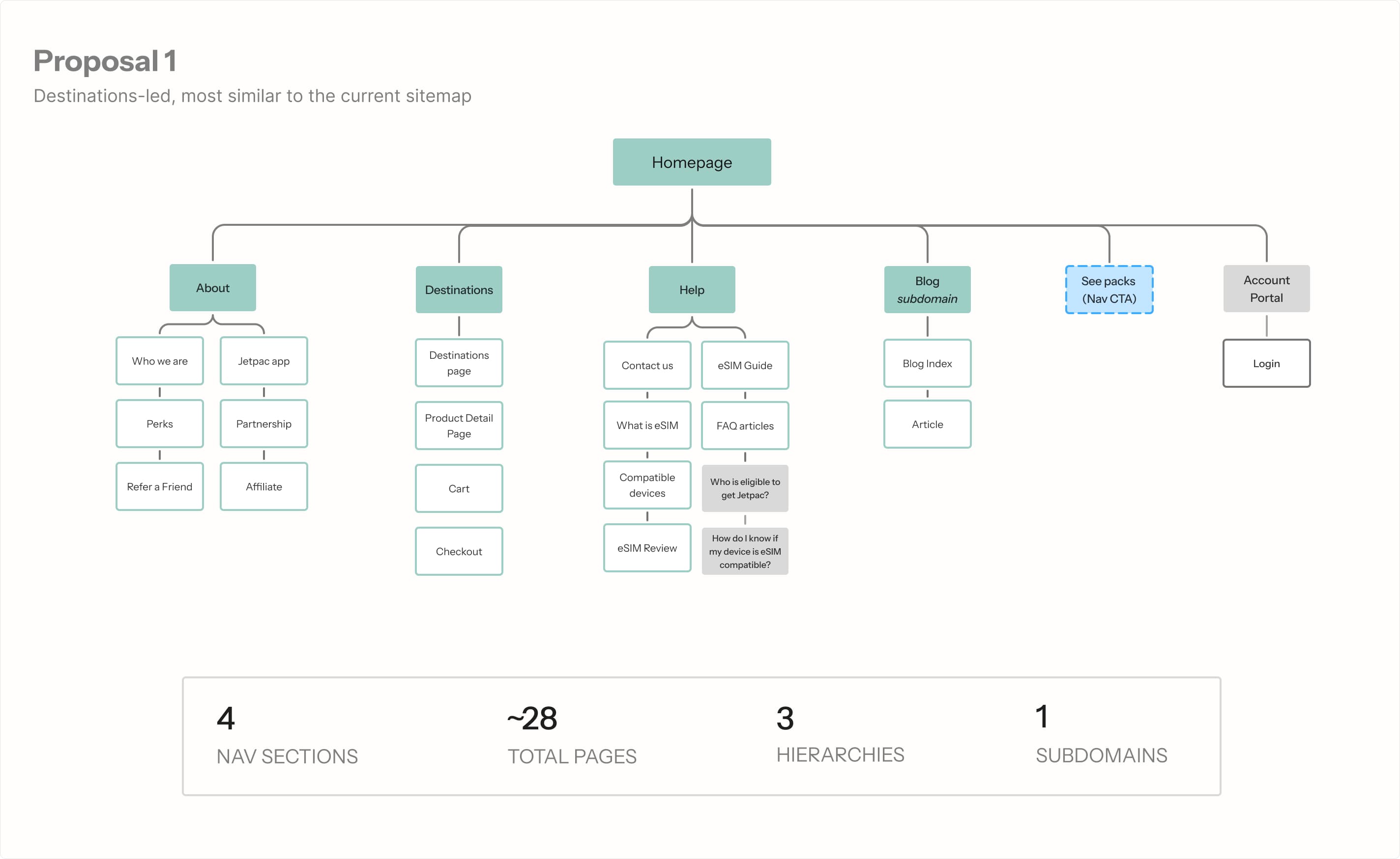
To align internal stakeholders on the 3 sitemap options, I facilitated trade-off workshops with the CTO and Chief Growth Officer to evaluate technical complexity against cross-sell potential.
Chief Growth Officer (Business Priority): Pushed for maximum surface-level exposure of Voice, Lounge Access, and Fast Track to directly address the 3% cross-sell baseline.
CTO (Technical & UX Constraints): Favored a minimal header structure to prevent mobile viewport clutter, reduce API load times, and preserve the high-converting eSIM checkout funnel.
The Design Compromise (Option C): I advocated for 4 Dedicated Product Hubs by demonstrating that consolidating redundant sub-pages (reducing total page count from 28 to 20) created enough real estate to give new products dedicated entry points without adding top-level visual clutter.
Translating one sitemap into platform-native interaction models
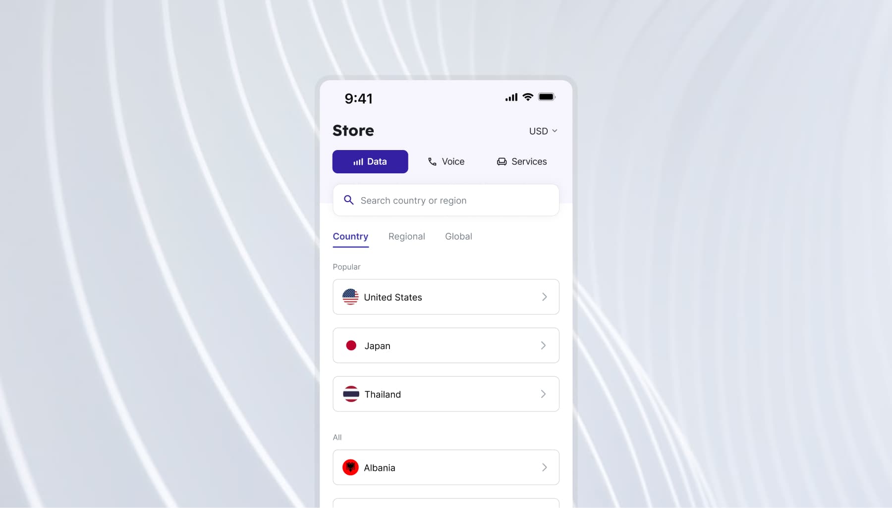
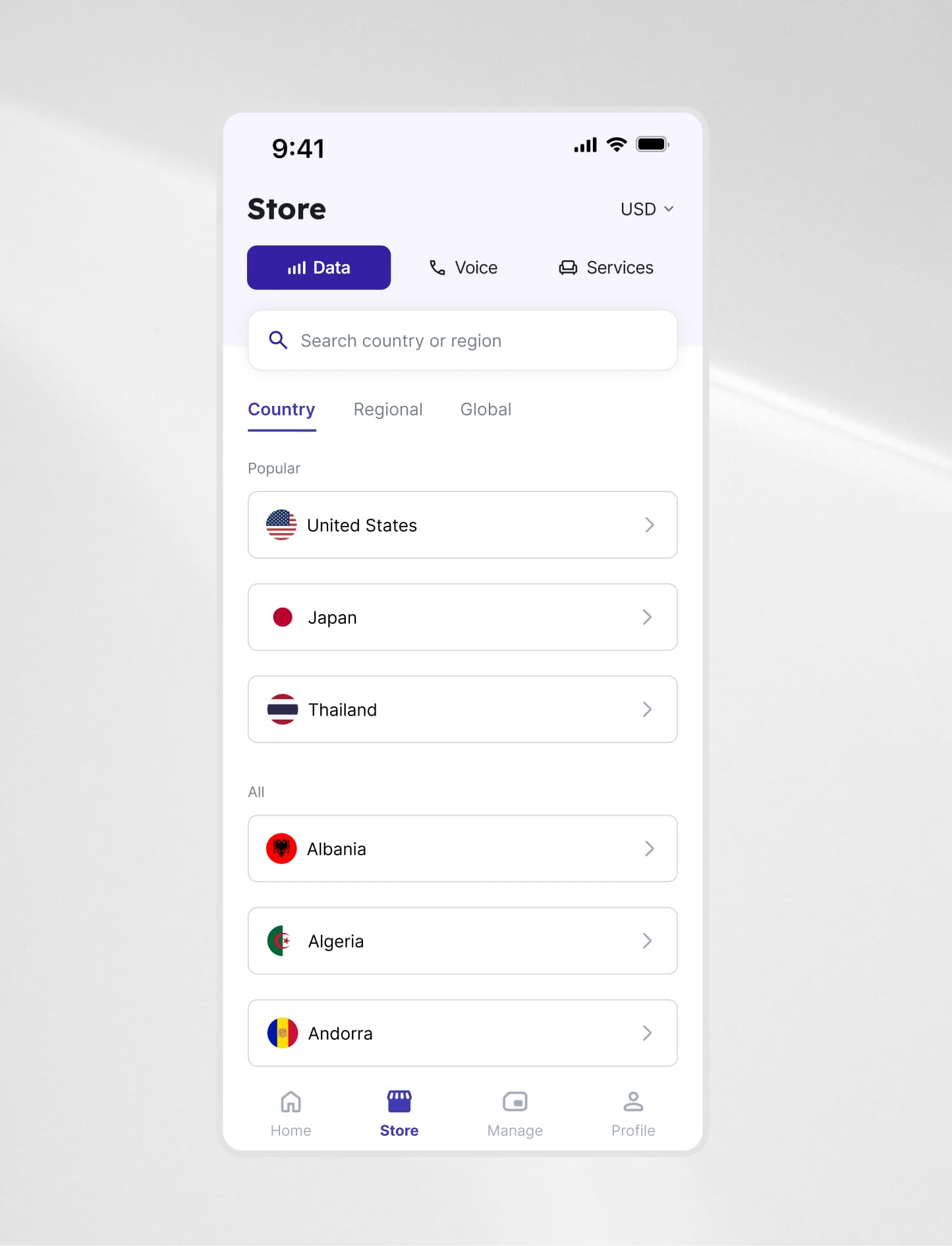
Aligning on the App Navigation
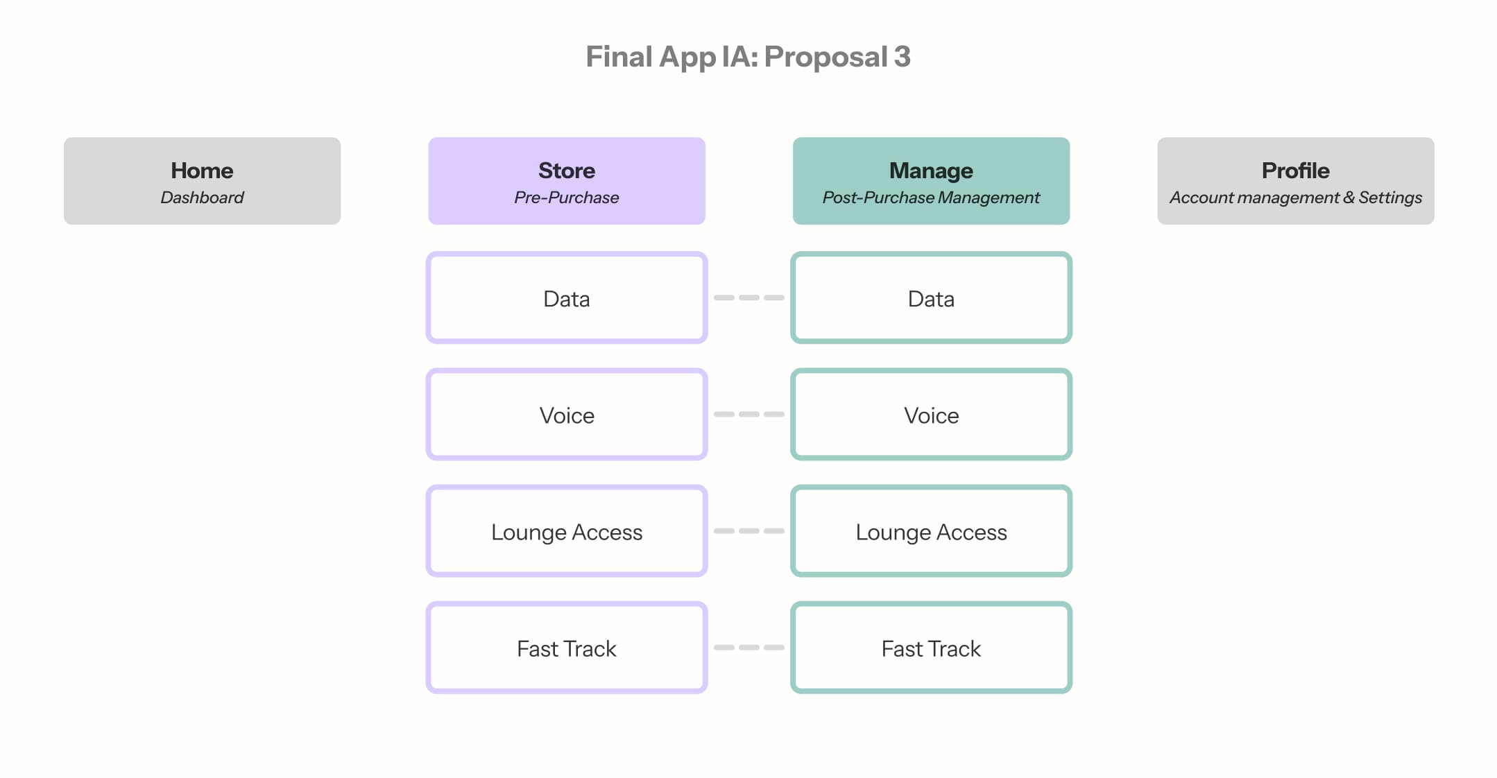
Three proposals came from three different parts of the team. Each reflected a different view of the app's primary job.
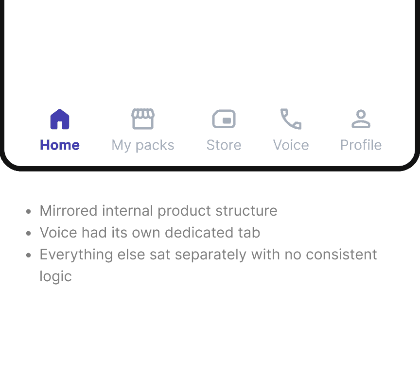
Proposal 3 was mine. Voice, Lounge, and Fast Track are products, not navigation categories. Everything purchasable belongs in the Store. Home, Store, Manage, Profile maps to how users think: arrive, buy, manage, account. Leadership aligned on it.
Exploring the Navigation's Visual Language
The Manage tab had no icon that clearly communicated its purpose. I explored 27 combinations of icon styles, active states, and label treatments before the team converged on a direction.
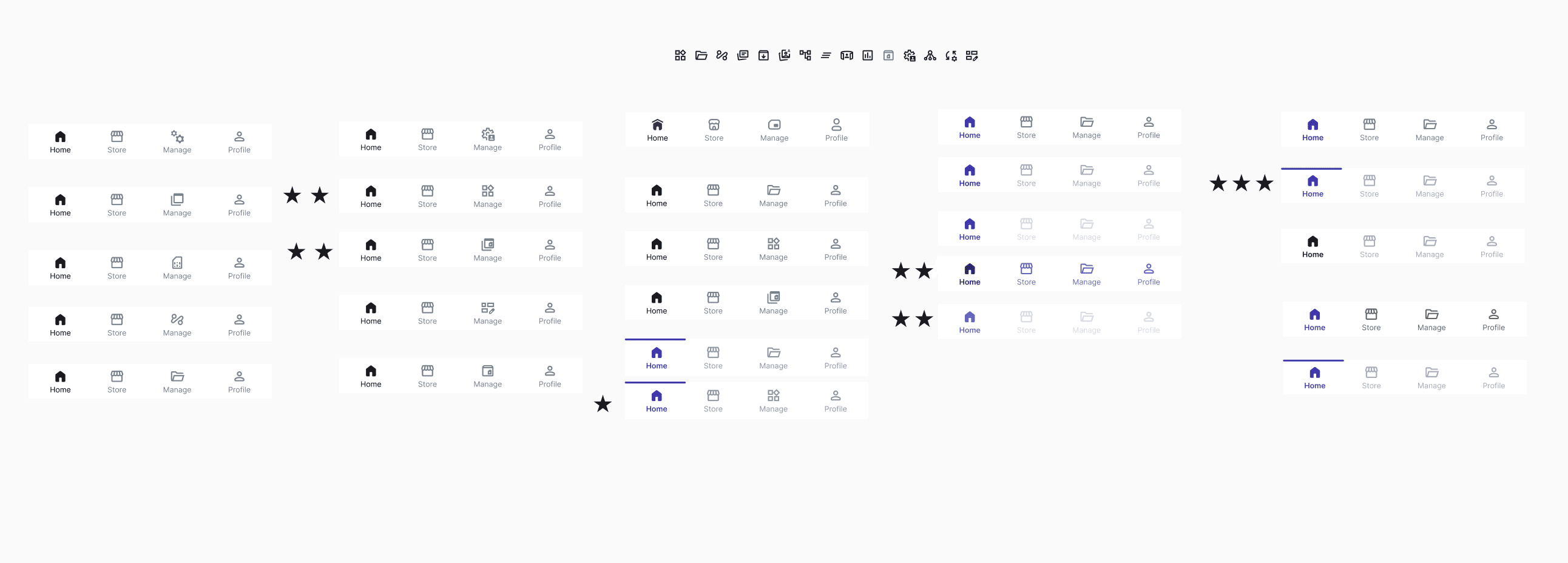
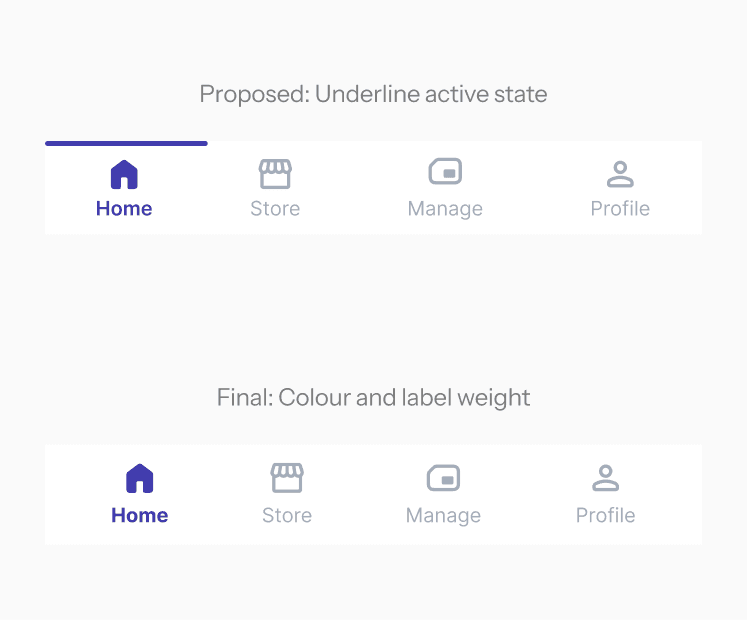
The preferred direction used an underline active state. Leadership flagged it as outdated before handoff. The final version uses colour, label weight, and a filled icon. 3 signals, so the active tab reads clearly without relying on colour alone.
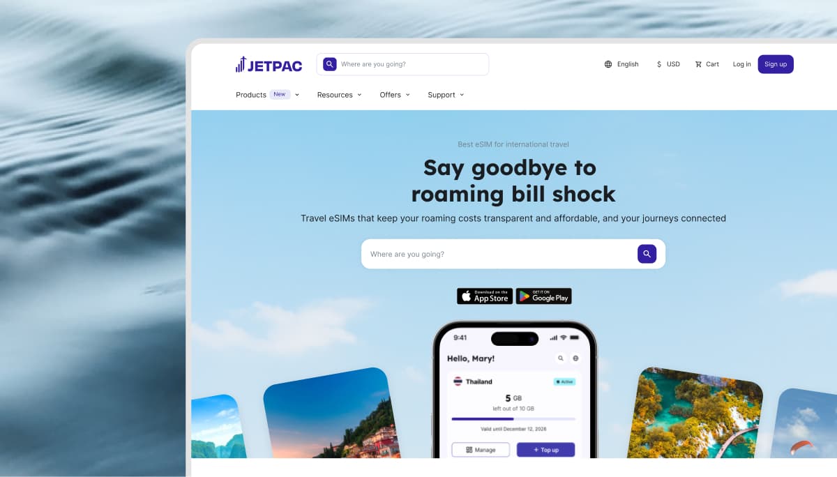
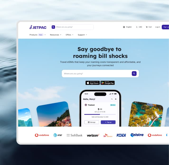
Desktop Web
Mobile prioritized quick access, but desktop needed to support research, comparisons, and account management across a larger canvas.
Website Navigation Bar
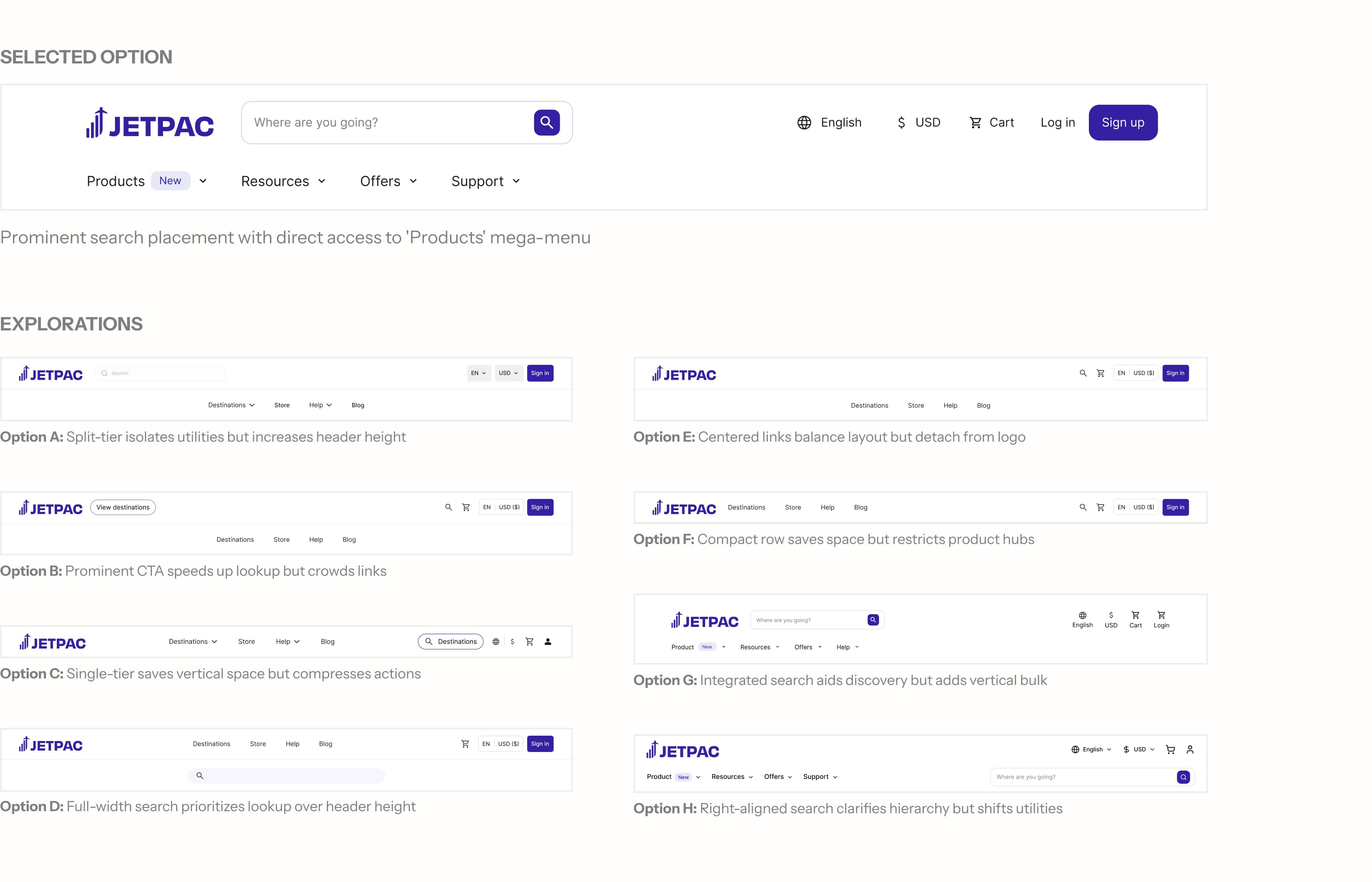
The new desktop navigation introduces a two-level hierarchy that places Products first to support multi-product growth. High-frequency utilities like Language and Currency move to a dedicated top tier, keeping the primary bar focused on commercial discovery through rich contextual mega-menus.
Same four sections, different structure for mobile. A full-screen drawer contains Products, Language, Currency, and account access. Outlined below are the 3 primary changes made.
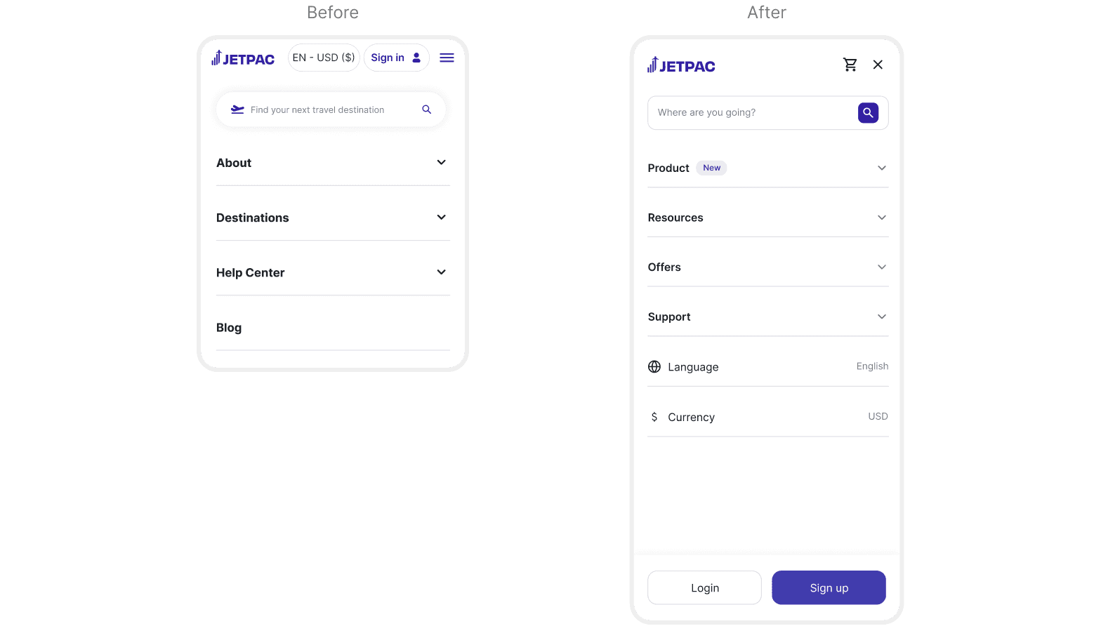
Surfaces all four products (Data, Voice, Lounge Pass, Fast Track) right inside the drawer, giving non-eSIM offerings dedicated entry points on mobile for the first time.
Groups secondary content and utilities into collapsible accordions, keeping the drawer easy to scan without crowding primary conversion paths.
Website Search
The original search only returned eSIM destinations. The new design keeps Data results primary while surfacing Voice, Lounge, and Fast Track as a persistent column alongside.
App Navigation Bar
4 tabs: Home, Store, Manage, and Profile. Active and inactive states are distinguished through icon fill, colour, and label weight.
What I learned
- 1Don't reference the pastIn a startup, whatever is currently live becomes the default benchmark for "good." But the existing nav was built for a different version of Jetpac which was a single-product app. Treating it as a reference point anchored early conversations to incremental changes rather than the structural rethink the product needed.
- 2Reduction is a harder sell than additionGoing from 28 to ~17 pages meant convincing stakeholders to let go of pages they'd built and owned. Addition feels like progress; removal feels like loss. I underestimated how much of the IA work was change management, not just design.
- 3Handoff is not the finish lineThe underline active state for the App I designed got flagged as visually outdated before the handoff review by a stakeholder. The final version changed as a result. On a live product, the design continues to be challenged after you've marked it as complete.